Tips For Shooting Engaging Beauty Product Photos
Getting great photos of beauty products can really make them stand out online or on social media. A sharp, well-lit photo tells the story of what makes a product unique and makes anyone scrolling stop and pay attention. Whether I’m snapping shots for my own skincare stash or working with a brand, I’ve picked up plenty of tips that make beauty products look their best on camera.
Lighting, setup, and a spark of creativity will seriously boost your results. Shooting beauty products might sound simple, but even a small change to your background or camera angle can make a pretty big difference in the finished photo. Here are my favorite ways to get those pro-looking results no matter what camera you’re using. Plus, you’ll find super practical steps to keep the process smooth and enjoyable for consistent, high-quality results.
Set Your Goals & Know the Product
Not every product photo needs to look the same. I always figure out who the photo is for and what I want it to say. Is the shot for an Instagram post, a catalog, or an online shop? Each has its own vibe. A luxury moisturizer might need a sleek, minimal look, while a colorful lipstick collection can feel bold and playful.
Questions to Consider:
- What’s the product’s main use (hydration, glow, antiaging)?
- Who’s the audience (young trendsetters, spa lovers, pros)?
- What mood matches the brand (elegant, fun, scientific)?
Quick Example:
- I love using crisp, white backgrounds for clean beauty brands.
- For a glittery eyeshadow, some sparkle or a punchy colored surface adds personality.
The more you know about the brand story and product features, the more intentional your images will feel. Take a few minutes to look over the packaging, check out any unique textures, and even read a bit about what makes each product special before photographing it.
Master Good Lighting: Natural and Artificial
Lighting is super important for beauty product shots. Soft, even light is usually the way to go. I’m a big fan of natural window light since it gives a fresh, real vibe. If the sun is bright, I’ll diffuse it with a sheer curtain or a white bedsheet. For night shoots or cloudy days, a basic ring light or softbox works very well.
My Lighting Checklist:
- Shoot in the morning or late afternoon for softer light.
- Use reflectors (white poster board works fine!) to bounce light and cut down on shadows.
- Keep consistent lighting from shot to shot for a cohesive look, especially in a series.
Pro Tip:
If you get harsh reflections off shiny packaging, try turning the product slightly or moving your light source to the side for a softer highlight. Small tweaks can really help and prevent glare from overtaking the image. Sometimes a bit of DIY—like holding up a piece of card to block direct light—makes all the difference.
Choose Backgrounds That Show Off the Product
Backgrounds shouldn’t compete with the product. Solid colors, textured paper, marble tiles, or even foam boards can make the product pop without screaming for attention. If the brand leans natural, I sometimes use real leaves or soft fabrics to add just a bit of texture without noise. Backgrounds can set a mood—earthy, luxurious, playful—or allow the product to tell its story center stage.
Popular Background Ideas:
- White or pastel poster board for a studio look
- Light gray, blush, or sandy beige for a soft, elegant feel
- Organic textures (linen, cork, subtle woodgrain) for earthy brands
- Glass or mirrored surfaces to highlight luxury or create cool reflections
Always check for little dust specks or fingerprints before hitting the shutter. A quick wipe can save editing headaches. Using backgrounds that tie into the season—a bit of greenery for spring, rich velvet for winter—adds mood and keeps photos feeling fresh.
Arrange, Prop, & Style With Intention
Great product styling tells a quick story. Before shooting, I set up the product so it’s the real star. For creams and lotions, I swipe a sample onto a spatula or a tile so viewers see the texture. With lipsticks, I’ll uncap one to show off that fresh, angled tip. Simple props add character and context—sometimes I’ll frame the product with petals, sponges, or other items that match the color story.
Styling Tips I Rely On:
- Group items in threes for balance.
- Scatter props (flowers, pearls, brushes) to draw the eye, but keep it simple.
- Keep the hero product in sharp focus and props a bit blurred if your camera allows.
Common Props:
- Basic tools (blending sponges, brushes, cotton pads)
- Application swatches
- Complementary shades or matching packaging for color stories
Props work best when they feel tied to the product, not just tossed in randomly. Aim for props that look natural beside your products and never distract from the main focus.
Work Smart With Angles, Crops, and Composition
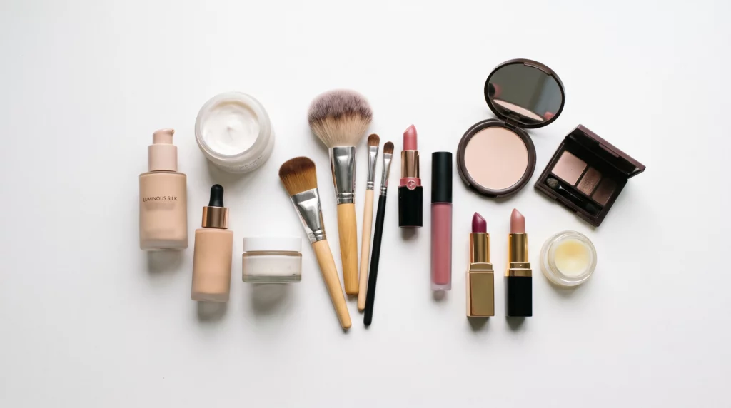
I mix up camera angles to see which works best for each item. For jars and bottles, shooting slightly overhead (about 45 degrees) gives a complete view but still feels threedimensional. Flat lays, or shots directly from above, are perfect for collections or sets of products to show variety and color harmony.
Go-To Compositions:
- Centered for individual hero shots
- Diagonal layouts for creative energy
- Negative space for a modern, airy vibe
- Rule of thirds to keep things visually interesting
Get the Focus Right:
I tap to focus on product labels or textured swatches. If your phone rocks portrait mode or a similar feature, it’s pretty handy for blurring backgrounds while keeping the product crisp. Don’t be afraid to try several focus points to pick which makes the product shine.
Edit Your Photos for a Polished Finish
I rarely post a raw photo straight from my phone or camera. Simple edits go a long way toward a professional result. My routine is usually: crop to improve framing, fix color balance for true hues, bump up sharpness, and remove stray dust or smudges. Free apps like Snapseed or Lightroom Mobile are super useful; you won’t need a degree in photo editing to get great results.
Editing Steps Worth Checking Out:
- Adjust exposure and white balance for true to life color
- Clean up distractions with a healing brush tool
- Boost contrast or clarity, but don’t overdo it; the product should look real
- Save a backup of the original in case you want to start over
When editing, aim for a natural finish. Beauty shots should make the product look appealing, not overly fake. Be cautious with filters and only adjust enough to let the colors and textures pop.
Stay Consistent With Your Visual Style
Posting regularly online? Using a similar color palette, background, and editing style across your photos ties it all together. It helps shoppers and followers recognize your look instantly. I usually pick a few favorite backgrounds and lighting setups and stick to them for each brand or campaign. Consistency is a key part of building trust with your audience, making your feed or site pop.
Ways I Keep My Style Consistent:
- Create a mood board or folder of favorite looks for inspiration.
- Save presets in your editing app to quickly match old photos.
- Revisit your best shots every few weeks for reference and improvement.
It’s really important for building an audience or professional looking portfolio. Swapping up your style is okay from time to time, but a signature look brings fans back and helps your work stand out.
Troubleshooting: Common Beauty Photo Questions
How can I avoid reflections on shiny packaging?
Move your light source around, avoid aiming directly at the product, and tilt bottles or tubes at a slight angle. Sometimes, just blocking glare with a piece of card works wonders for tricky materials like metallics.
What if I don’t have fancy equipment?
- Use natural light, a clean table, and a phone camera for great results.
- DIY reflectors and backgrounds from household supplies work just fine. Even poster board or bedsheets can get you started with style.
How do I keep products dust-free?
- Keep a microfiber cloth handy for quick wipes during the shoot.
- Check for dust or fingerprints regularly during your shoot, not just after. Keeping an eye out as you work is easier than fixing in post.
What about editing mistakes?
If you go too heavy with edits, just use the undo button or revert to your saved original. Less is usually more! Taking a break before a final review also helps you spot overedits and bring your work back to natural.
Final Tips & Action Plan
Creating scroll-stopping beauty product photos gets easier with a solid plan and a bit of practice. Good lighting, clean backgrounds, and a consistent vibe will help your images look sharp and professional. Set aside time to practice each step and try new props, angles, and styles every couple of shoots for ongoing improvement.
Your Beauty Photo Checklist:
- Set up in a spot with natural or soft artificial light.
- Pick a background that compliments (not overwhelms) the product.
- Wipe everything clean and prep a few simple props.
- Shoot from different angles until you find the best one. Experimentation is your friend here.
- Edit just enough to keep it fresh and natural, not overdone.
Got any favorite props or styling tricks? I’d love to see what everyone comes up with! Share your shots or tips next time you post—creative collaboration always brings new inspiration and can take basic shots up a notch. Keep shooting, play with new ideas, and you’ll be amazed at how much your beauty photography can improve.
Make your own images with this professional AI tool
-

How To Set Up Affiliate Links Properly
-
Tools For Creating Stunning Beauty Graphics
-
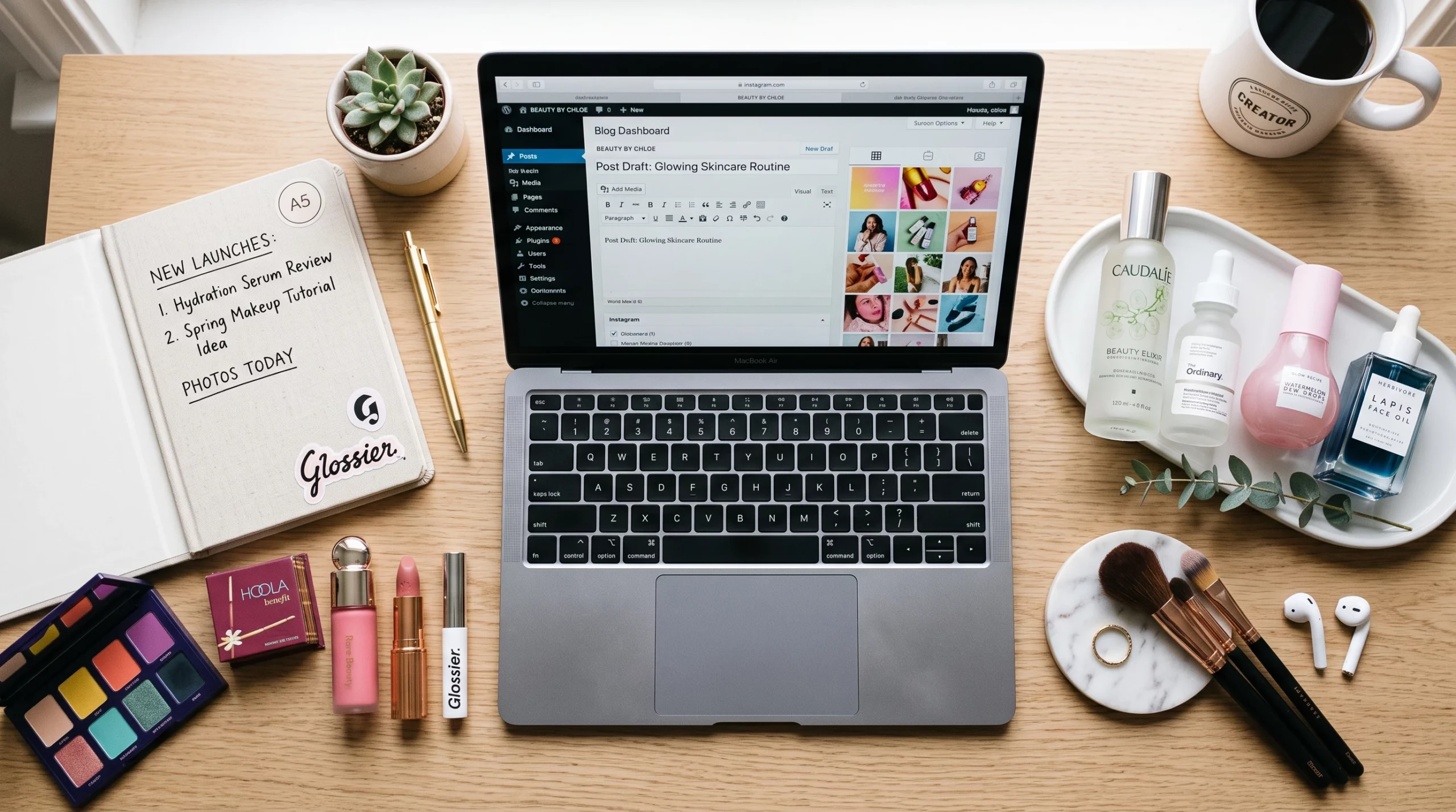
Write SEO Optimized Posts For Beauty Niches
-
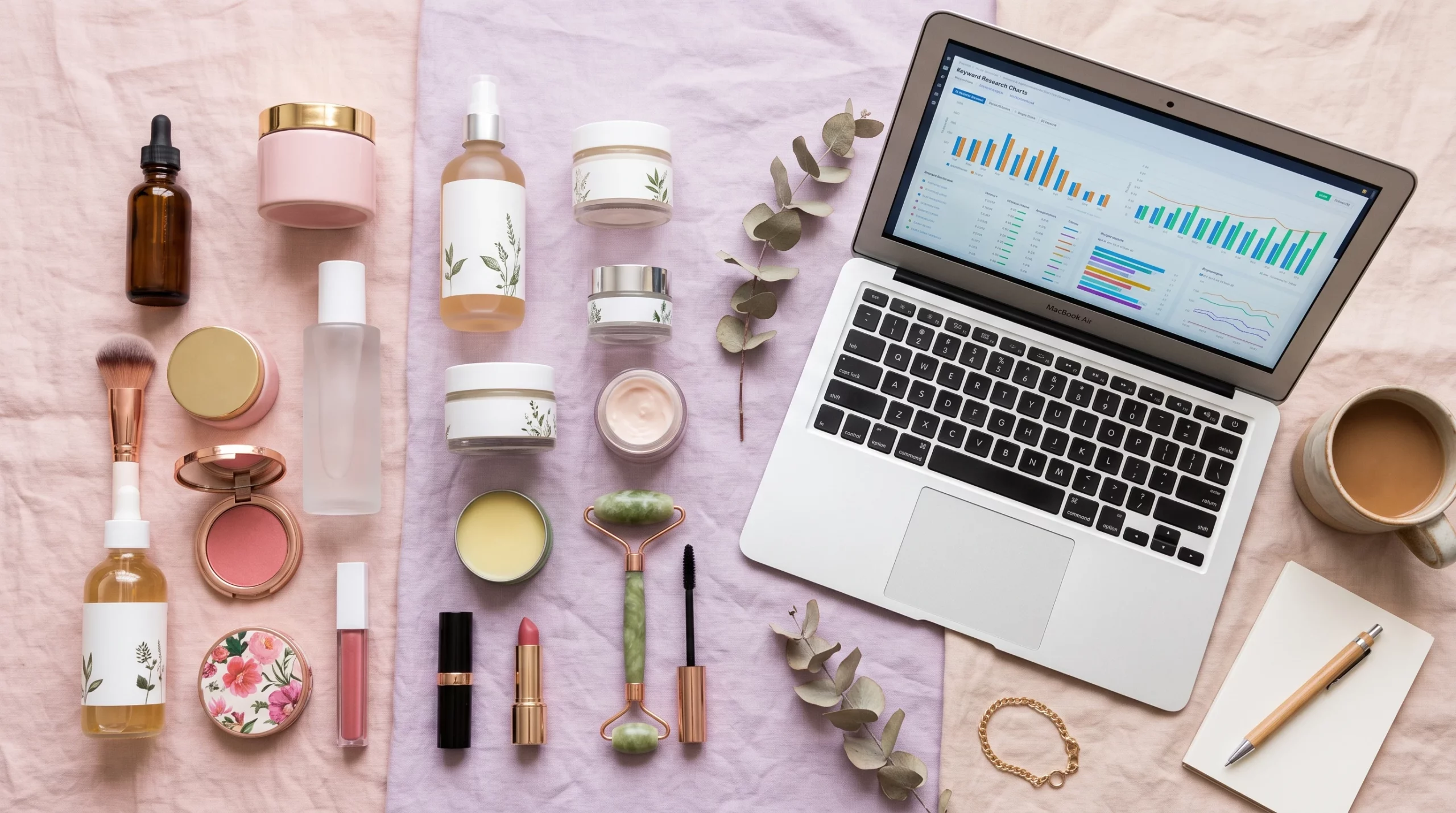
The Top Keyword Research Tools For Beauty Niches
Join a thriving community
Stay in the loop with everything you need to know
And build your own online presence!